(or: sorry this
isn’t actually a drawing, like I’d promised)
Jesse, I’m really
proud of you for working so hard to make this comic you’ve been
talking about forever! A major downfall of former art students on
their way to being professional artists is that after school, they
simply stop making art, but you have persisted! Recently you’ve
been tweeting about the difficulty of making a comic that has setup
shots when you aren’t comfortable drawing scenes that require skill
with perspective. While this means you can’t write your comic the
most straightforward way one would like to, I hope you can turn this
stumbling block into an advantage. For one thing, it will give you
the freedom to pare your art down to what’s absolutely necessary
and simultaneously give your artistic strengths a chance to shine.
Hopefully you can also create a cohesive style between everything in
the comic, from set-up shot to intimate scenes. From an engineer to
an artist, maybe this can shed some light, or at least another
perspective, on your problem.
Focus on what’s necessary
Back at Dordt, a big
part of my senior design class was focused on the essential thought
processes in making a design. One lesson was we had to always keep in
mind the actual problem and not let our imaginations get away from us
and lead us down some pet project that might not actually meet the
client’s needs. While you are following a more traditionally
creative profession, that’s still sometimes a necessary line of
thought. The various scenes in your comic will serve a function, but
there are many ways to get that function without necessarily doing
the conventional thing. Your issue is with three-dimensional looking
establishing shots, and I can think of a number of things those shots
do, but I imagine not all of them are necessary to what you’re
trying to communicate. If it’s a sense of place, you can do that by
drawing close-up scenes of the things on the walls or in the streets
or whatever it is that you’re doing. If it’s to create a sense of
grandeur, you could consider playing with the boundaries of whatever
medium you intend to publish this comic in. For example, if you want
it to be a printed book, you could include a fold-out page to say
just how big the scene is. Whatever it is you need to do with a
scene, focus on the function you need and results will follow.
Style: maximizing strengths
Remember, every
artist’s style is just them dealing with what they can’t/don’t
like to do by focusing on what they’re good at, and that’s the
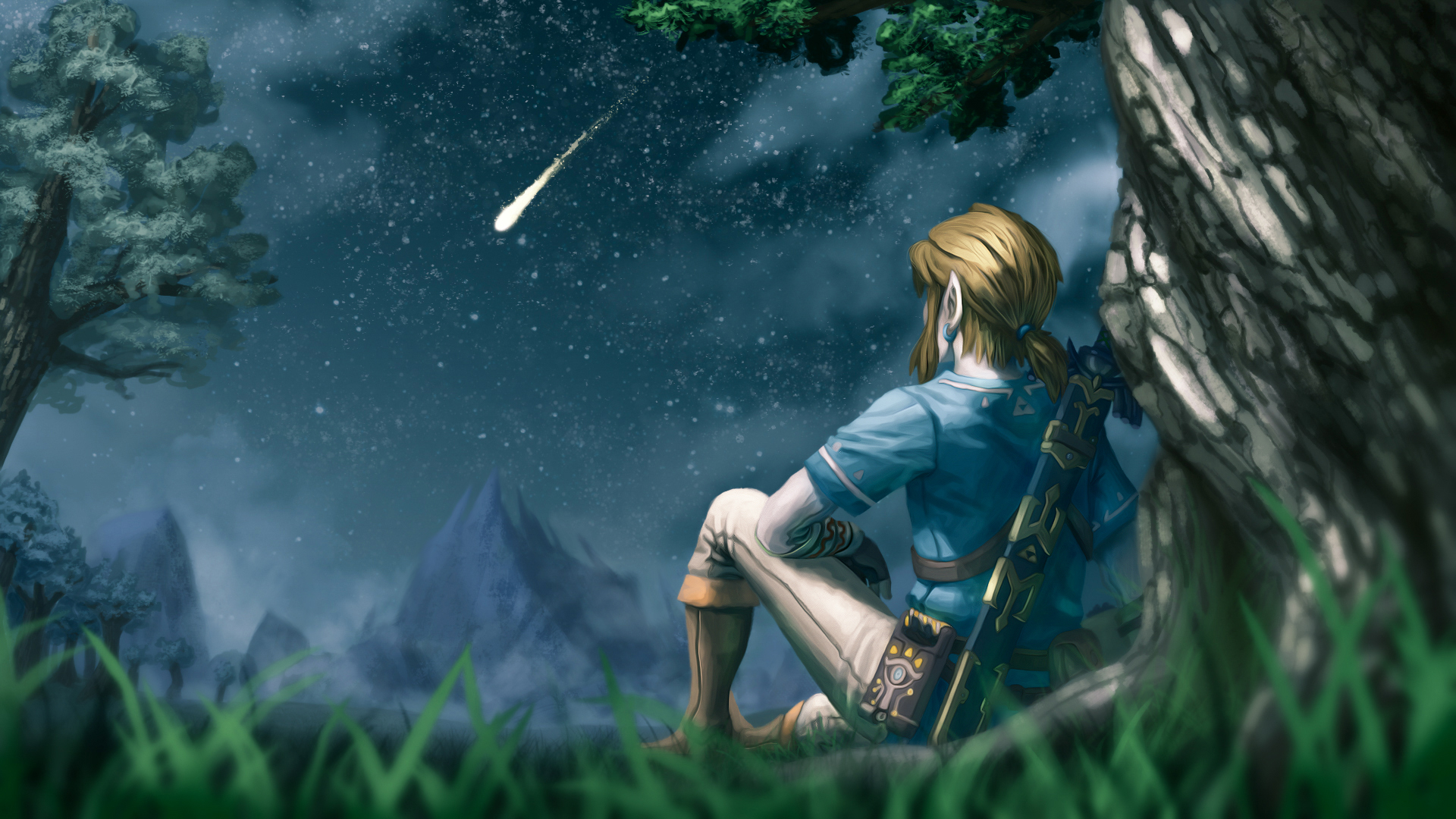
same for you. For example, Kit is best at people, poses, and color,
so you’ll find all his paintings have that as the focus and the
strength.
 |
| A Moment of Quiet by Kit Drennon |
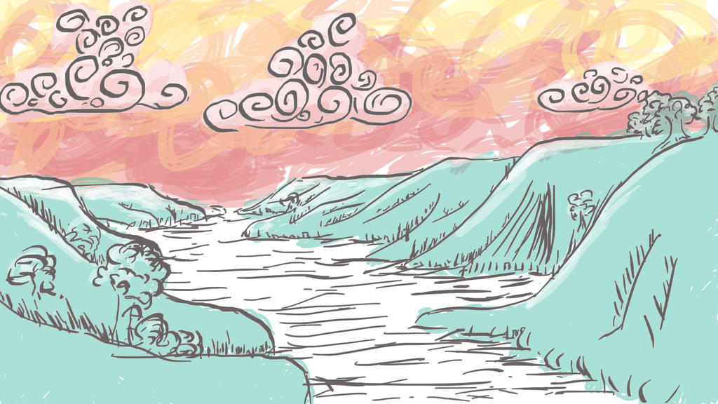
At the same time, I
have somewhat a difficult time with things other than landscapes that
have any sense of body, plus I’m fascinated with abstract art, so
when I’m doing my own thing, it results in this “storybook”
sort of style.
 |
| Here is a landscape I drew after a long bus ride through SD |
I’d love to be as
good at drawing people as Kit is and I think Kit would love to make lineart
as comfortably as I do, but when we maximize our own strengths, it
results in us having a particular style. From what I’ve seen of
your work, your style is well-established. Run with it!
The importance of cohesive style and repetition of elements
I’d discourage you
from hiring out your more difficult scenes, as you’ve suggested,
because it might dilute the style of your work. Especially since the
way you were framing it in our conversation on Twitter made me think
it really would be more “hiring out” and less collaboration. You
know how Studio Ghibli films have this ...well, Studio Ghibli-ness to
them? That’s them refusing to use 3D graphics in their films. And
it’s so good. That doesn’t mean other, possibly completely
different, styles of animations are bad, but a Ghibli film feels like
a Ghibli film because they stick to their style. As you build up your
comic with many shots that establish whatever is necessary to be
established, that will be a foundational element to your style as it
concerns [whatever topic]. It will be woven throughout the comic,
rather than plopped on like a bookend (unless having things look
bookended is your style). A bassist-turned-YouTuber, Adam Neely, has
a great clip about how repetition creates legitimacy in your work.
You could make a wonky scene once and then have the rest of the
drawing be perfect and people will know you made a wonky scene, but
if you do it over and over again then people accept it as a
legitimate part of the work. So try a few different ways to establish
whatever information you need to be establishing. Maybe don’t put
too much effort into the first drafts, but do put enough in that
what’s needed to be conveyed is communicated. Then, look back and
see if the repetition of whatever technique you tried works for the
comic as a whole.
I hope this helps,
Jesse. I’m looking forward to seeing what you do!